Digital magazine heroes, here’s a hint: PDF.
If you’ve tried publishing an interactive digital magazine online, you’ll know that PDF magazines are a pain. If you haven’t but are researching best digital magazine design practices, this quick overview is an essential read.
 We’ve all seen thousands of free and paid PDF magazines available across media sites. If so many people seem to find it useful, why waste your time thinking about PDF’s shortcomings? Because the digital publishing space is changing rapidly, and publications disappear faster than ever.
So if you already produce content on the web (through a blog for example), what’s stopping you from finding a simple HTML to PDF converter and turning your website into a static PDF magazine?
That’s precisely the wrong way to think about it. It’s never been easier to put together a digital magazine. If you want to build a sustainable digital publishing business, you need to maintain a competitive advantage over the millions of other publishers.
And what is the key to that? It’s simple – interactivity.
What Is An Interactive Magazine?
First things first, when we talk about apps in the context of publishing, things can get a little confusing. Traditionally, we use the shorthand ‘app’ to refer to an endless variety of software applications available to you, from video games and chat, to fitness and expense tracking. Interactive applications can help you perform certain functions based on your needs. This is the domain of software development.
As publishers, we are in the business of producing content – information that’s shared through a wide variety of media (text, images, videos, gifs, etc.). Part of the magic of being in a mobile-first world is that everybody has access to incredibly powerful devices that support all of these different media.
As print publishers, you are restricted to text and images.
Bring a screen into the equation, and that quickly broadens the scope to include a much larger variety of media. It’s tempting to think that the only added advantage of building an interactive magazine is to include videos, GIFs, motion graphics, ie. moving images that would be impossible to print.
However, the real potential for publishers lies in interactive media. The government, entertainment, business, whatever your niche might be – from beautifully designed infographics to real-time quizzes, the possibilities of what you can do with your interactive magazine are limited only by your imagination.
With intelligent digital publication design, you can deliver a completely unique experience to your readers each time.
If you are an already experienced magazine publisher, how can you take advantage of the explosion of newsstands that promise to digitally deliver your publications to homes across the world? Here’s your first option:
InDesign to App In A Few Easy Steps
Magazine publishers have produced some of the finest designers of the modern age. The entire allure of magazines come from the package: typography and pictures and ideas come together to create a beautiful immersive experience for the reader. Ever since image-editing software such as Photoshop got adopted as the industry standard workflow for designers, the layout of books, newspapers, and magazines have been designed on computers.
 Therefore there is a huge population of highly talented designers, people who are proficient with software such as Adobe InDesign and Photoshop.
And combined with the power of Adobe’s Digital Publishing Suite, it was really quite simple to digitize your magazines and easily distribute them.
The problem started when Adobe stopped showing any love to independent or semi-professional publishers. Our friends at Ajar Productions said it best:
“First, Adobe took away DPS Single-edition, which allowed individuals and smaller business publish apps from InDesign.
Now Adobe DPS has become AEM Mobile.
It’s even more expensive, and much less connected with InDesign.”
All this to say that it’s only a little bit more roundabout to have a workflow that involves InDesign now. Our suggestion? To use in5 to convert your file into an HPUB format, and use MagLoft’s services to build 3 solid distribution channels – a native iOS app, Android app, and Web App. All completely branded, with analytics and flexible monetization plans.
But hold on, you might say…what if you don’t know anything about InDesign? Or Photoshop. You can’t code, you can’t design, surely digital interactive magazines are not an option for you right?
Wrong.

Enter The Typeloft Editor, For Noobs and Pros Alike
When we first built MagLoft, the idea was quite simply this: to democratize the ability to build media-rich interactive magazine and distribute it however you choose – on newsstands, through a web app, or a fully branded native iOS or Android app.
We figured that for indie publishers, the number one concern for starting from scratch was getting their magazine to look clean and professional.

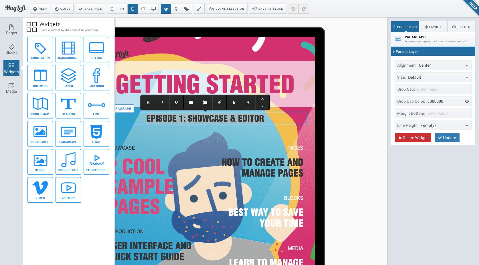
So we built TypeLoft, a simple drag-and-drop visual editor. Like any modern layout assistant, we use fully-customizable content blocks so that users can quickly design a page. No coding required. Or for that matter, no design required.
This isn’t about MagLoft (although we’re pretty awesome, you gotta admit). All this is simply to say that if you really feel at home with a design workflow that involves InDesign, there’s absolutely no reason for you to change that. You can still take full advantage of MagLoft – simply bypass the editor, and get straight to uploading your content.
But back to the main question of the hour, choosing a design-to-distribution workflow that follows best practices of digital publication design.
To PDF Or Not To PDF, It’s Hardly A Question!
If you are a commercial publisher, you will obviously be looking for ways to monetize the content you produce. You can put out a DRM free PDF and tell people not to share it. If you’ve ever downloaded a movie using illegal torrents (or ripped an audio CD if you’re a 90s kid), you know that there is no effective solution to the problem of piracy in sight.
So then your only alternative becomes DRM. The Wikipedia entry for “digital rights management”, or DRM describes it like this:
DRM technologies try to control the use, modification, and distribution of copyrighted works (such as software and multimedia content).
Great! So if there’s a system in place to prevent people from unlawfully accessing your content, then you’re covered, right? Not so much. Using DRMs will come at a significant cost, the compromise being your reader’s experience. You will not be able to read the PDF in any viewer that handles videos or interactivity of any kind. In other words, you’ll be selling a static PDF even though you market it as an interactive one.
Digital Magazine Design 101
PDFs stand for portable document format. Think of them as a large collection of images arranged in a particular sequence. This is great for replicating a print copy of a book, magazine, or document. Everything from the fonts to the margins will look exactly what the physically printed page looks like.
 This also makes PDF the very opposite of what we refer to as “responsive” in web designing. Try reading your magazine on an iPhone or tablet, and it’ll make you cry with frustration.
In the world of ebooks, this challenge was solved by reflowable ePub files, that organize the text around the screen rather than the page.
Depending on whether you’re reading on your smartphone, Kindle, or laptop, the book responds to the screen size and offers the optimum reading experience.
This means that there isn’t even a static set of page numbers like in a physical book, as the length of the “page” depends on the screen you’re reading it on, and the font size, margin, and line spacing settings you have chosen (yes, isn’t it wonderful to have all that control?).
And ePubs are essentially a collection of web pages. Make the book media-rich, add some interactivity to that, and you’re much closer to what a digital magazine needs to handle. Taking a page from ePub’s book (pun not intended), we magazine publishers also need a file format that’s essentially a collection of web pages that can be easily distributed as a single document.
What you just described is the HPUB, a bundle of HTML5 pages that allows your digital magazine to handle complex interactivity and media like a breeze.
Put in its correct context, all seemingly complicated problems have a simple explanation, and none more so than in the case of PDFs being a poor choice for interactive content. PDF is not meant to be responsive. It’s built to create documents in a layout that can be easily printed. That’s it!
Now go build a beautiful digital magazine 🙂
