As technology advances, the way we read and consume content and knowledge has evolved. The media we prefer to read depends on its practicality and reading experience as much as its substance.
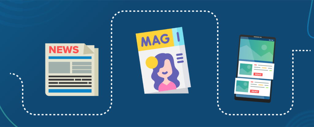
As a millennial, I grew up in the 90s with print, be it magazines, literature or even research journals. The generation of my parents used to get their information and entertainment from daily newspapers delivered to their doorsteps. Nowadays, access to this information is always at our fingertips, just one click away.
Evolution of Reading and Content Consumption in the Age of Digitisation
Technology is constantly changing, as well as human behaviour when it comes to consuming content. Understanding what your target audiences are looking for and their reading habits can help you appeal to your potential readers. We want them to choose your publication over the other billion resources out there.
How do people read in 2022?
When it comes to digital content, people don’t read. They scan.
Readers can only afford so much time on reading. With a sea of information out there, you need to demonstrate quickly what makes your content worth their time.
A recent study found that the average human attention span has fallen from 12 seconds in 2000 to 8 seconds today, shorter than a goldfish’s.
This highlights the importance of offering content with an incredibly fast loading time. Imagine if your web page takes 5 seconds to load; you’ll be lucky if they hang around for it to fully load, and if they do, it better have been worth the wait.
So let’s have a look at what readers expect from a digital publication.
It’s essential to hold your readers’ attention early, so they’d decide to continue reading your content.
Important information up-front: Deliver your value fast
Front-loading the structure of our content allows people to quickly understand when they’re scanning. Web users are busy: they want to get the straight facts. For example, the writing style inverted pyramid, which starts with the conclusion, respects readers’ time.

The writing style can be illustrated as a triangle balanced on a single point, representing the fact that content goes from the broadest facts to the smaller details
On a web page, place your most important message above the fold, which is the first thing readers see without scrolling. Get their interest, then let them decide for themselves whether they want to keep reading or not.
Clutter-free Layout: First impression matters
Humans are visual creatures.
Even before we consume content, we would first recognize elements on the screen and how they come together. Intentional design with plenty of white space is more likely to provide clarity to your readers at first glance. Thus, more pleasant user experience, compared to an overcrowded, cluttered layout, like this quintessential example:
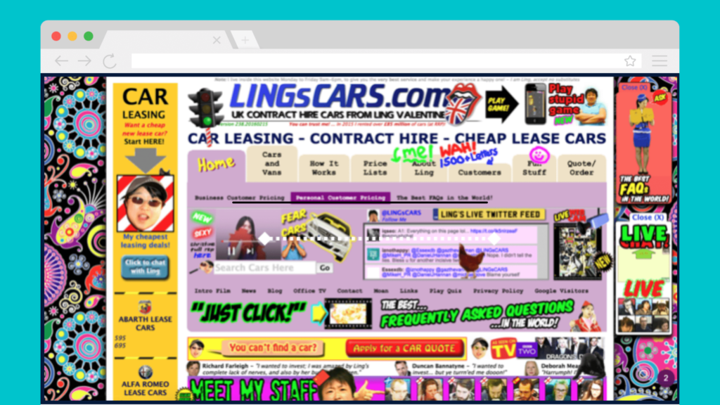
How does the homepage layout above make you feel?
Now, let’s compare it to the homepage below:
Do you notice a difference?
No overwhelming information, please: Break up your content
This helps readers scan to quickly find what they’re most interested in.
- Use clear and fluff-free headings & subheadings
People detest sales-y content. Clear and concise language helps reduce the mental energy required to quickly understand your content and the value it offers. - Format your most important information into bulleted lists and bold text
Incorporating this style into your content allows the eye to focus on the most important information. - Combine different types of text, images, and media
Text-heavy content could look dull, unbalanced and tiring to read on the web page. Combining it with appealing images and other interactive media could help convey your content visually in a more engaging way, even in short-form writing.
While helpful, combine different media types wisely and in moderation. You don’t want to go overboard. For example, having too many different elements on one page may distract your readers rather than draw them in.
Importance of a good reading experience
Great content alone can’t make up for a poor reading experience.
Most of the time, readers aren’t consciously paying attention to how well an article reads until it bothers them. So keeping things simple and intuitive could give them a breezy time enjoying your publication. The gist is: Don’t overthink it.
Yet, it’s still common to see the following pitfalls, even in 2022.
Interactive Elements: how much is too much?
Subtle interactive components are cool. Intrusive elements are nasty.
Infamous auto-scroll carousels and intrusive pop-ups are still heavily utilized, and the digital publishing industry is no exception. Unfortunately, most publishers have yet to realize that these types of elements can cause more harm than good to their readers.
When people decide to continue reading your content, they want to enjoy their time on your page. Distracting elements on auto-movement could catch them off-guard and could take their focus away from your content and from finding what they’re looking for.
What can you do instead?
If you’d like to lead them to take a particular action after reading your content, you can place subtle yet clear call-to-actions (CTAs). For example, if you want them to subscribe to your newsletter or purchase a paid subscription, you may want to place a form at the end of your article.
Use engaging yet subtle Call-to-Actions (CTAs) so readers spend more time on your publication
If you insist on displaying pop-ups, make sure to time them well. For example, only show them when readers are trying to leave your publication or after they’ve spent a good amount of time.
PDF is inconvenient for humans to read
Research spanning 20 years by NNGroup, one of the world leaders in research-based user experience, proves PDFs are problematic for online reading. Yet many in the digital publishing industry are still using PDF for their digital publication, even though users continue to get lost in them.
Publishers may feel that they have more control over the layout and appearance with PDF Pixel Perfect design. Instead, they risk losing their readers. PDFs are unpleasant to read and navigate and remain unfit for digital content display, especially when accessed from mobile phones.
What can you do instead?
If you’re currently publishing your content solely as PDF, there are low-cost solutions that can help you bridge the gap. Take the PDF toggle view feature from the Universal App. Your readers can choose to either enjoy your content in PDF format or in responsive HTML design, which is easy for them to read.
Provide Your Readers with Reading Experience from Best of Both World: HTML view and PDF view
Readers do care about the credibility of your content
Nowadays, it’s easier than ever to create a digital publication. It seems that everyone can be a publisher. While it’s easy to get your initial set of content published, make sure not to skip the due diligence of fact-checking your sources.
How do readers judge credible content?
Good writing with high-quality graphics and the use of outbound hyperlinks to credible sources can help improve content credibility. Links to other sites on relevant points show that you’ve done your research and provide genuine value for your audience.
Avoid boastful subjective claims, which readers can clearly see as exaggerating. Credibility suffers when content is made up of dubious words.
Do readers want to hear from you? The yays and the nays
Now that you have attracted people to read your content and create an account on your publication, how do you keep them engaged, so they come back for more?
Nobody likes receiving spammy emails or notifications. But some informative messages are tolerable and even welcomed when done right. Keep in mind that readers like to be in control of what they want or don’t want to receive.

Monthly Newsletter
Depending on the frequency and type of content, your readers may subscribe to a newsletter. We recommend a monthly newsletter over a daily option to avoid cluttering up your readers’ inbox.
Weekly digest via email
This is my favourite way to keep up with most publications. The frequency is just enough for readers to stay up to date, without disrupting their daily activities. Often, the weekly digest curates trending articles of the week, and it’s relatively easy to read.
In-app notifications
As the name implies, in-app notifications are messages that appear within the app and only while users have it open. It could be a message displayed when logged-in users are browsing your publication. Or, it could be aggregated info listed in the bell icon on the top right corner of the app.
Subtle in-app notifications are preferable, as it doesn’t disrupt the reading experience. As long as readers can control what type of activities are going to be delivered, they usually don’t mind receiving an in-app notification. It usually comes in handy, especially when readers are expecting engagements or replies to their comments.

Push Notifications: Would readers like to stay updated each time a new article is published?
If you publish time-sensitive content, such as breaking news, giving readers an option to enable push notifications is a good idea. However, be wise in using this for content types that don’t require immediate attention. With a few missteps, a push notification can transform from invitation to intrusion.
Conclusion and Next Steps
We’ve covered the aspects of what your readers want, the next step is to reach them. Make sure to read our article on how to get in touch with (potential) readers.
